
Autonappi
Improve UX of a mobile app for car sharing application.
Role
UX/UI Designer (Research, User flows, Wireframes, UI design, documentation)
Sector
SaaS
Team
Product owner, Project manager, Front-end developers, Back-end developer, UX/UI Designer
Overview
Autonappi is a Finnish car service operator for reselling joint vehicles which maintain, develops and enables the rental of shared cars. The service is based on the automotive technology that Autonappi installs before the vehicle is delivered to the customer, allows car reservation, GPS positioning, door management and rental.
I worked with the company as a freelance UI/UX designer and helped improve their mobile application and ease the overall experience of drivers.
The problem
The service has two systems for car leaser and driver. This project focuses on the end-user (driver) mobile app for rental assitance. Findings from usability testing and survey showed two major UX issues with the existing design:
Users were overwhelmed with the information and could not find relevant information for them.
Users got stuck during some user flow and quit the app.
The solution
Redesign the current rental application to help increase overall customer satisfaction and ease the process of using vehicles. This includes finding pain points in the current design and understanding user needs to suggest design improvements that help increase ease of use for the app.
Results
The following changes were made during the redesign:
Added confirmation messages to provide users with feedback on task success/error
Introduced a new calendar display for booking slots, making it easier for users to find and reserve a car.
Reduced the main menu from four tabs to three.
Developed a responsive version of the app.
Redesigned the visuals while maintaining the primary brand colors.

Prototype
The redesigned experience achieved:
Improved task success rate for main user flows.
Faster booking process through simplified calendar interaction.
Reduced navigation complexity by reducing unimportant tabs on the main menu.
Improved comfort with minimal UI elements.
Research
The first step was to identify all UX issues in the current application. I began by testing the app myself, followed by usability testing with both a first-time registered user and an existing user. Afterward, I collaborated with the product owner and lead developer to analyse user feedback collected so far. Overall, users struggled with multiple functions, felt overwhelmed by excess information, and perceived the app as underdeveloped. By pinpointing these issues and aligning on priorities, we were able to create a clear path forward to improve the user experience.
Target audience
Startup hubs (Maria 01, Aalto Startup Center) & their communities.
Methods
Usability testing with new and registered users.
Competitive analysis of car-sharing apps.
Email survey via Mailchimp with System Usability Scale (SUS) for quantitative insights.
Expert evaluation with NN/g 10 usability heuristics, focusing on visibility of status, recognition, minimalism, and help/documentation.
Key insights
Users were overwhelmed by too much information on one screen.
Missing support led to confusion in booking and driving processes.
Registration delays discouraged early adoption.
Define
Problem statements
How might we reduce information overload so users can complete their tasks faster?
How might we add contextual support during the journey so users don’t abandon tasks?
Success metrics
Ease of use (measured by SUS score).
Task completion rate (booking, driving, payments).
Main User Flows
Registration: Sign up and verify driving license verification / Login.
Reservation: Calendar-based booking with private messaging option if overlap occurs.
Payments: Multiple card support (private/company/family) linked to verified driver ID.
Driving: Step-by-step car check-in, unlock, drive, lock, return flow with optional photo verification.
Design
Registration: when the user wants to register to use the service.
Screens flow: Splash screen > Login / Sign up > Terms and Conditions > Confirmation
In order to make the registration process easier, we added help features such as short descriptions and explanations for why we require certain information from users. As part of the registration process, users will be asked to submit pictures of their driving license to verify their driving permission.
Currently, it takes 1-3 working days for the user to be approved to use the car. However, we want to improve this process to shorten the approval time by create automated approving feature in the backend. That way, the user can begin using the car as soon as five minutes after submiting their driving license.


Make reservation
Screens flow: Calendar view > Make reservation > Confirm Reservation > Your reservations > Details
The system displays the available time slots in a Calendar view, making it easy for the user to see them at a glance. The user can choose a suitable time slot by clicking and dragging it from the calendar. In case the user needs to use the car, but it's already been booked by someone else, the user has the option to privately message the booker and ask if there's a possibility to switch to another time.
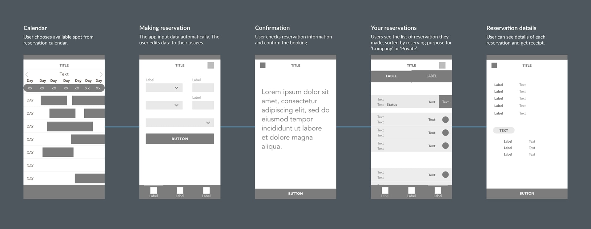

Reservation
In the Reservation tab, the car owner can see all the reservations. Reservations are divided into two categories according to usage: Company usage and Private usage. We also send a monthly report to the car owner on his car's usage. Under the Reservation tab, car owners can view all reservations made for their cars. Reservations are categorized based on usage, either Company or Private. Additionally, we provide a monthly report to car owners detailing the usage of their cars.

Manage payments
Screens flow: Listing > View Card list > Settings
The user has options to input different payment cards. This is because the car user can be using a shared credit card, for example with his family, a business partner, a company card, or a community one. Since the user was identified with his driving license from the registration process, we ensure shared credit card usage is under control.


Start drive
Screens flow: Check-in car > Unlock car > Driving > Lock car > End ride
Users are required to take pictures of their car from all four corners before driving. However, in case of an emergency or if they are in a hurry, they can skip this step. If they choose to do so, they must confirm that they are bypassing the picture-taking process at their own risk.


Develop
We iterated with the product owner and developers in 2-week sprints:
Created wireframes and flows in Adobe XD.
Collaborated with devs to refine technical feasibility.
Updated documentation for smooth handoff.
Delivered prototypes for usability validation before final implementation.
Conclusion
The redesigned Autonappi app significantly improved usability, efficiency, and trust for both drivers and car owners. By focusing on reducing information overload and providing contextual support, we improved user satisfaction and streamlined the car-sharing journey.
Learnings:
Small UI changes can have a big impact on usability.
Continuous usability testing is critical to find out users pain points in real-world tasks.
