
Twinsie
Twinsie is a concept app aims to ehance peronalization in flight seat booking experience.
Role
UX/UI Designer (Research, Wireframes, UI Design)
Sector
Airline Reservations Mobile App
Team
2 UI/UX designers
Overview
Twinsie helps air passengers find seat options based on their preferences for comfort, price range, and body measurements. Passengers' privacy is prioritized by storing data locally on their devices, ensuring it is only accessible to authenticated users. Access can be granted through biometric identification or a customized passcode. We aim to provide a customized booking experience that caters to individual preferences and requirements.
The problem
Passengers can request special seats on airlines using several methods, primarily during booking, online check-in, or by speaking with airport staff before or during boarding. They can ask for specific seat types such as window, aisle, or exit row seats, ensure they sit with travel companions, or accommodate medical needs and disabilities.
However, seat availability is not always guaranteed, and passengers often cannot check availability from the beginning when searching for flights. Some airlines charge extra for seat selection during specific booking periods, with varying prices. For customers who have specific seat requirements, their main goal is to select seats as a priority. Unfortunately, the current airline booking systems lack a flow for seat-specific options and a cost comparison function.
The solution
We created Twinsie concept as an integration for the airline check-out process. Our goal was to create an easy and almost automated way for passengers to find seats that best suit their needs. This solution is presented as an independent booking flow within a flight booking application for mobile platforms (iOS). It combines the features of a standard flight booking system with users' body measurements and personal preferences into a single application.
Result
We conceptualized a feature that addresses a real gap in airline booking systems by integrating body-specific options and personal preferences.
Designed and developed a prototype to demonstrate how passengers could experience a more customised booking flow.
Tested and validated the concept with real users to evaluate usability, value, and feasibility.
Prototype
Research
Identify target audience
We conducted interview with general flight passengers. We then categorized passengers based on their prioritized values and personal preferences when traveling. Our research result suggested three major groups of the target audience, namely those who:
Favor comfort over price
Favor convenience over price
Favor cost over comfort and convenience
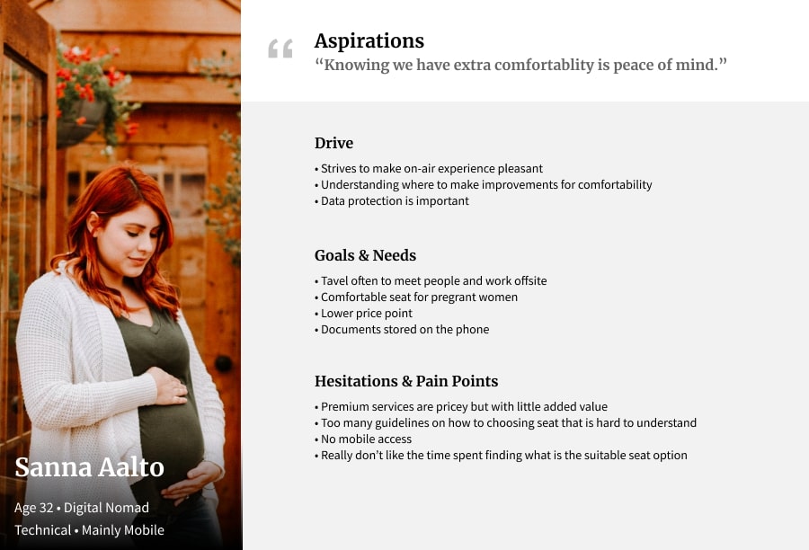
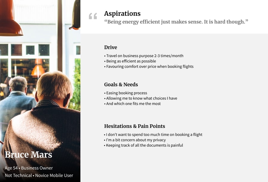
Personas
Once we decided how the app should work, we create personas to find out who are we designing for. Our initial research result suggested that our potential audiences are those who favor comfort over price, convenience over price, and cost over comfort and convenience. We use empathy mapping to understand their needs and pain points during booking flight tickets.
Define
Feature prioritization
Must-have | Nice-to-have |
|---|---|
|
|
Information Architecture
Prior to proceeding with visualizing concepts and ideas, we created a brief flow to organize paths that users will follow when using the app.

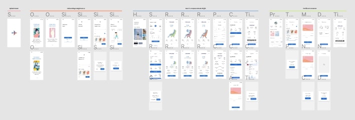
Wireframe & Prototype
We used the Crazy 8 method to sketch out ideas for "Search Flight" and "Flight Comparing" screens as they are the major important features and can contain dilemmas. Then we sketch out low-fi wireframes for paper prototyping.
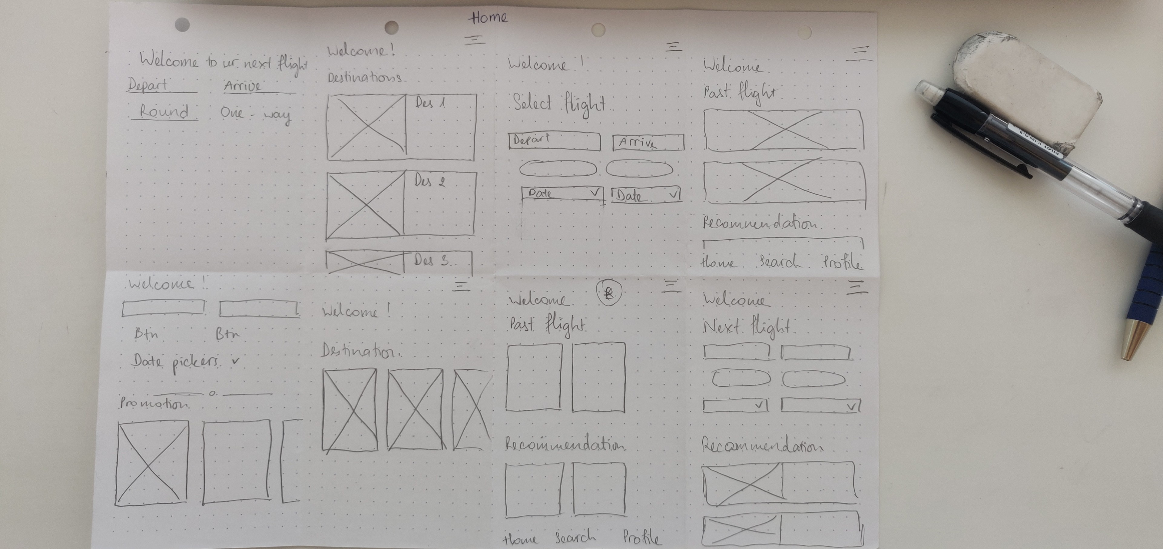

After figured out the main features, we moved on to sketching initial low-fi wireframes of the main screens.

We next want to evaluate the main flow from the Main screen to selecting a suitable flight seat and confirming the booking. So we created digital low-fidelity wireframes in Figma to develop a clickable prototype for initial usability testing. We tested several rounds, identified usability issues and iterate before moving onto high-fidelity design.

Low-fi Clickthough Prototype
Design
As we aim to create a communal and friendly feeling, we used light blue as the primary color and light orange as the secondary color. The illustrations used in onboarding screens are from open source. To demonstrate the project idea of comparing seat options, I drew their seat option illustrations using Adobe Illustrator. Below images are v1 and v2 iteration of the app's visual direction.

Current design v2 with addditional screens and interactions
On-boarding
Information regarding users' body measurements and travel prioritized value are acquired to provide the most relevant search results. These steps can be skipped and information can be added and/or modified later under the Profile section.

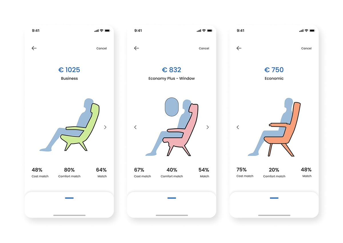
Search Flight
Concerning the main objective of Twinsie, search results include Comfort Matching percentage besides other essential information, namely departure and arrival destinations, flight time and duration, and price.
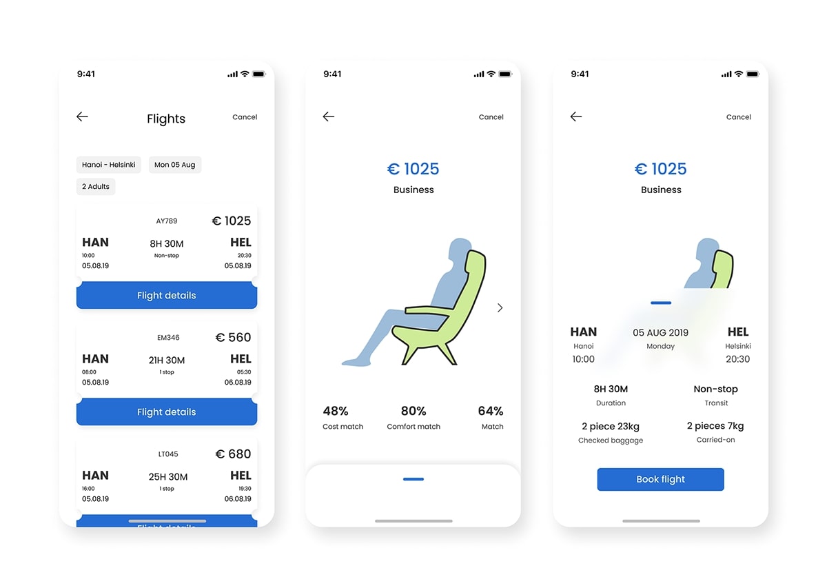
Comparing flight and seat options flow
Twinsie highlights air passengers' comfort by displaying seat selections with users' digital twin as flight search results. Users' digital twins have also presented seating in the chosen seat, to give a better demonstration of expected on-flight experience and comfort. Seats are categorized into class and in-row locations. Further information regarding flight on the chosen seat is handed out within the expandable card underneath.
Develop
Within the project scope, we focus on developing our ability to conceptualize a business idea and create a simple design system using Figma. We aim to improve our skillset and learn through doing. In the future, we aim to improve the design with user testing and feedback. The project was a successful prototype that illustrated and practiced design within the given timeline, even though further research could validate customer needs.
Conclusion
Key learnings of the project:
It is important to align user needs with business constraints, in this case the it means the balancing of user's comfort, privacy, and cost efficiency.
Rapid prototyping and testing helps refining an abstract idea into a tangible solution, that can be evaluated by both users and stakeholders.
